
UPDATE!! Well, it just goes to show how I haven’t kept up. Anthony informs me that GISS simply went to a new version of their data. The new version of data can be found here. So, I probably should graph with newer version, and will soon. Now, a normal person would ask, ‘what’s the difference?’ …… See next post!
I’d like to thank Anthony Watts for stopping by and reminding me of what I should have done ….. probably a couple of years too late. Many readers will know that while I was regularly blogging I posted a couple of posts of what our “global warming” looks like on a regular thermometer. When I first came up with the idea, it was just for a filler post, something to kind of dig at the alarmists. Out of the thousands of graphs I made on this blog, this has been the most enduring graph I’ve made. To this day, if one “Googles” the title above, you can find my graphs. The last one I wrote was 4 years ago. I always thought my crop production increase to population growth graphs were much more compelling. I know I put a lot more work into those than these …… you just never know.
Hopefully, this new WordPress blog writer will render properly, and hopefully, I can master the new Excel 2016 well enough to get some good visual. As I recollect, I used Office 2003 for the originals, and Open Office for the last one.
We will discuss the graphs after displaying them.
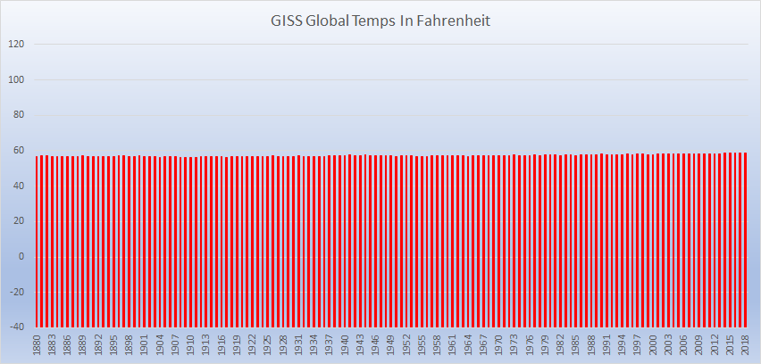
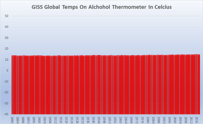
Each red line on the graphs look like what it would if one could read the annual temperature on a typical alcohol thermometer. Each line, a new year.
Now, I haven’t engaged with a lot of alarmists as I had in the past, but, I imagine they’ll still hiss at the sight of these graphs. Why? Because when any rational person sees these graphs, they’ll understand the ado over global warming/climate change/climate emergency …. whatever, is much ado about nothing. All that hysteria over this …… 😐
As good skeptics may wish to reference these graphs, please allow me to arm you with some defense to those who may wish to attack the representation of our global temperature change in this manner.
First of all, and foremost, the data represented by these graphs are not mine. Neither did I manipulate the numbers in any fashion other than to change them from the anomaly form to absolute values, as prescribed by NASA’s GISS, themselves, the source of the data. Please go to the bottom of the linked page and see for yourself, and any of those who may doubt what I’ve stated here. For those wondering, I used the J-D (January through December) column for the annual data. Again, this isn’t my data, this is NASA’s GISS’ data. Also, because I used GISS’ data, the baseline period (1951-1980) and the average value (14C/57.2F) is also what is represented in the graphs. See here. Unfortunately, the data only runs through to July of 2019. It seems our former POTUS decided NASA should focus on real space missions rather than redundantly concern themselves with imaginary climate concerns. We’re paying enough people shriek about nonsense we don’t need NASA to do so. I’m sure with our current administration, though, there’s a good chance they’ll be back.
As to why I put it in such a format: I put it this way because this is the way most normal people relate to our temperatures. Now, they can see for themselves instead of the wild anomaly graphs the crazies put out which most people simply can’t relate. Now, they can look at them and decide for themselves if they wish to put hairshirts on and convince people they should live in mud huts or something.
Disclaimer: I, in no way, manner, shape or form, endorse the values GISS has stated. I don’t believe them to be any more real than the tooth fairy or unicorns. They weren’t real to start with (by their own admission) and they’re not real today. The notion of a global average temperature, even in the abstract, is very suspect. In actual application, it simply isn’t possible to have one, not today, certainly not yesterday, and we won’t tomorrow. The supposed temperature of the globe isn’t real, it is impossible to determine. The hyperbole and concern isn’t real. It is simply misanthropy and self-loathing. These graphs were made to help demonstrate these thoughts.
Again, I’d like to thank Anthony for a trip down memory lane, and giving me some new challenges with new software and aplications to work with! It was fun! Hopefully, these graphs will add to the endurance of the now family of graphs we’ve shown!

At least he got you to post! Good to hear from you. How’s the wife and kids?